
The rise of mobile phone web use
Mobile phones used to be primarily for communication purposes; phone calls and text messaging. Remember the big, antenna signaled black Motorola mobile phones that we had? Today, smartphones are part of the generation’s essentials. Not only does it provide range of communication aid such as email, video calls, etc. but it also has the ability to browse the web and even buy clothes or order a meal from our phones!
Statistics show that mobile phone browsing is rising and it won’t be surprising if it exceeds desktop use soon. Well who doesn’t like the ability to look up information, read news, or purchase things on the go?
Mobile Phones: Share of web traffic |
|---|
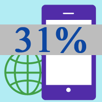 |
As of January 2015, according to We are Social web traffic on mobile phones is on the rise. |
This advancement prompted businesses to find a way to market their own brands, products and services to provide more convenience and accessibility to users. We have websites and apps providing range of services on mobile and now, Google recognizes this importance in their latest mobile friendly websites update.
Beware Google’s mobile update is out: Mobilegeddon
Mobile searches has skyrocketed and Google is taking action to provide the best service for it’s customers.
This February Google announced that they will soon update search algorithms to reward websites that are optimized for mobile devices. And on April 21st, they launched it. The update was called “Mobilegeddon” as it was expected to shake up search results when using mobile browsers. Websites that have not passed Google mobile friendly test will notice drop in rankings (only few places down). This update will potentially increase rankings for mobile optimized sites with responsive design.
According to research performed by IABUK (Internet Advertising Bureau UK) in March 2015, 10% of TOP 250 UK Brands didn’t have a mobile optimized website. The rest of these brands had mobile optimized websites but roughly about half were using responsive web design to optimize their sites.
Just imagine, If this research was performed only on top UK brands you can imagine how many smaller companies don’t have mobile friendly website that follows all the Google’s update guidelines.
One of the reasons Google made this change in algorithm is not only because they want to provide better results for mobile users but it also wants to maintain it’s place as quality service provider in the age of mobile.
How does mobile friendly website look like?
A mobile friendly website is basically a website version specially designed for mobile use. Mobile phones having a smaller screen would of course shrink the size of websites in its browser but with mobile friendly feature or what we call responsive feature, websites adjust for mobile phone use. A mobile friendly website displays differently to allow users a better experience through adjusting text/font size, adjusting menu, re-sizing images and buttons and so on.
A website that is not responsive will cause difficulties for mobile phone users. Users will have to zoom in and out to read small text, buttons and links may not work as well as they should and navigating through the site would just be a nightmare.
On the other hand, mobile friendly websites will no doubt give flawless user experience because of the special responsive adjustments.

More advantages of having a mobile friendly website
Aside from better user experience, Google also added indicators for users to see mobile-friendly sites from search results. Now that the public is recognizing mobile friendliness more and more, of course people would choose a mobile optimized website from an outdated, non-responsive one.
As you can see from the image below, search results from mobile phones now have a light gray text underneath indicating “mobile-friendly” which can really improve user experience.

Important to know that this search update only applies to individual pages up to 10 and not the entire website.
Also, Google have recognized mobile friendly sites by adding mobile-friendly criteria as one of their SEO/ranking basis. Go ahead and search for your keyword in your mobile phone and you will see that most top ranking websites have light grey text indicator next to the description saying “Mobile-friendly”.
Our website used to be on the lower end of page one of Google search result for the keyword Magin (locally) but after the mobile friendly update, we have seen quite a big leap. Our website is now on the third place as of today.
Being mobile friendly does not guarantee a huge boost in Google search ranking but it is certainly one of the things Google considers now.
Don’t be left out!
Is your website mobile friendly?
Well it’s very easy to find out by testing your website in google’s webmasters tool page. Simply copy your website address and paste it on Google’s official mobile friendly test tool.
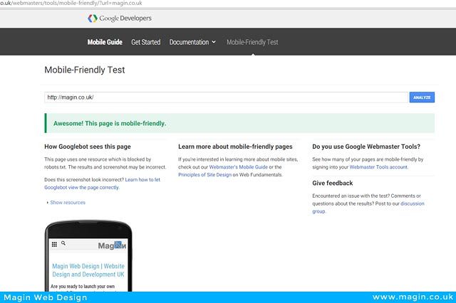
Assuming that your website is friendly for mobile devices just like ours, then you should not worry about anything. And you can even be happy about it because the biggest search engine should reward you with higher position and that means more visitors to your website plus, mobile friendly means your user’s are having the best user experience when visiting your site through their mobile phones.
Not mobile-friendly |
|---|
 |
What if your website receives this message from Google’s Mobile friendly test? |
For those who got a red message instead of green, then there might be some work for you to do. Google will recommend some tweaks and give you some tips if you have some minor mobile friendly issues but for some who don’t have mobile responsive sites, then you should seriously consider updating or entirely redesigning your website so it would not hit any penalties and fit in the mobile friendly criteria.
Assuming that if you haven’t updated your website within last few years then probably your website is not mobile friendly and might loose a few notch in rankings in Google’s search results. You should better take action and find out how your website can have it’s own mobile friendly website version.
Get your website optimized the right way
There are two ways to make mobile friendly website optimization.
- Less recommended option
Website designer will create separate mobile website or app different from your desktop website.
Your website redirects to your mobile friendly version site once users visit your site through mobile phone.Most websites use m.yourdomain.com or mobile.yourdomain.com or even entirely different domain to execute this. Some can slow down loading time and even confuse users. But it does work fine.This is recommended for websites who wish to keep their look and not lose some features that cannot adjust in mobile phones.
- Option that we recommend
We recommend responsive websites that automatically detects mobile visitor and will adjust design for the best user experience. This is less hustle, simpler, and doesn’t need any redirection.
Note that either website optimization is equally mobile friendly.
Final thoughts
So is Google’s Mobilegeddon something we should be worried about? Absolutely no. Whether your website is mobile friendly or not, still, the best way to rank high is to maintain a great website, good content and best user experience. Google is not necessarily penalizing websites which are not mobile friendly instead, it is giving a hint that its time for us all to update. Google is sending the message that being mobile friendly is essential to improve user experience and in return, increases ranking, visitors for our websites in the long run.
Responsive websites are currently offered in the market. You just have to find the right people to create or redesign your website for the best price.
P.S Do you have any questions about mobile friendly websites? You can comment below or contact us for free advice or quote whenever you need one.
Check out this amazing mobile app to make money online.


Leave A Comment